-
Products
Services
Tools
Industry Specific
-
Solutions
By Business Type
By Business Function
By Industry
- Support
- Login
- Try it for free
Bar chart helps to compare each categorical values of the whole data. One axis of the chart shows the categories and the other axis shows the measured value. This chart is also called a Column chart.
This chart option is visible only if
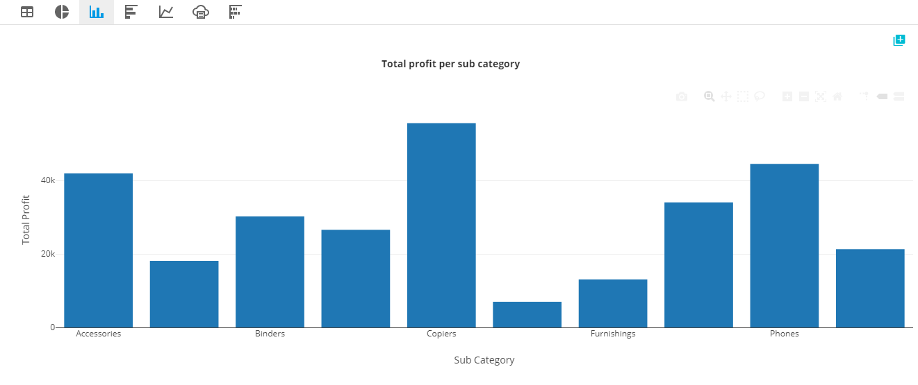
Attributes other than time attribute is placed in the x-axis and the measure in the y-axis. This chart is best for comparing categorical values.
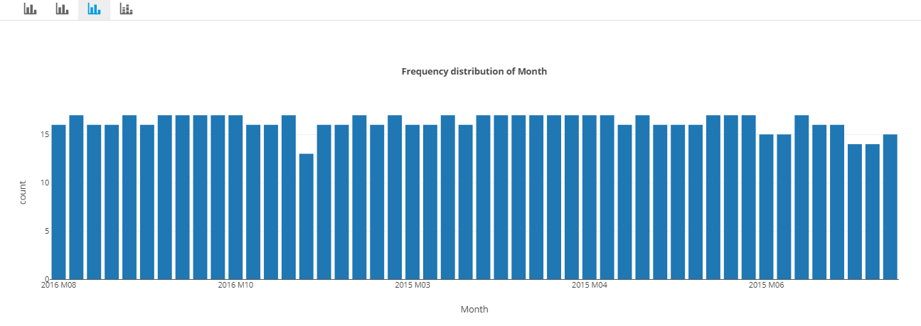
Time attribute is placed in the x-axis with a measure in the y-axis. Best for time series value comparison.
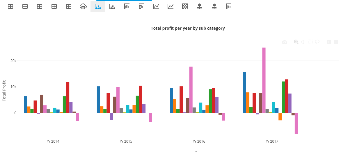
The not-time attribute is placed in the x-axis. The measure is placed in the y-axis. Time attribute is represented by color. Best for comparing not-time attributes with time attribute.
This chart option is visible only if
Search term with at least one measure and two attributes.
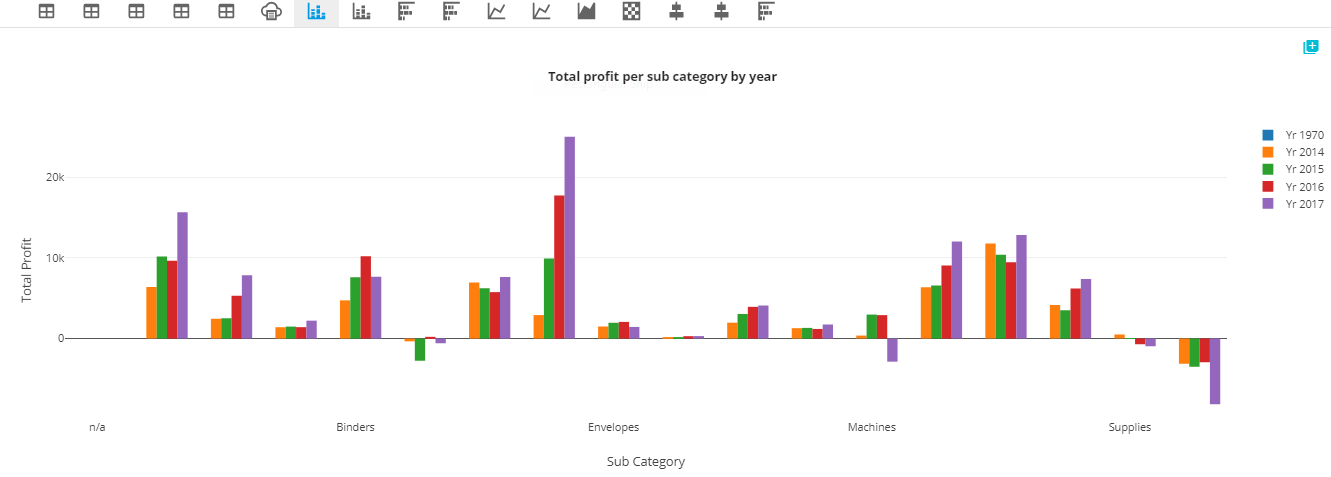
Time attribute is placed in the x-axis. The measure is placed in the y-axis. The not-time attribute is represented by color. Best for comparing not-time attributes with time attributes.
This chart option is visible only if
Search term with at least one measure, one time attributes and one not-time attribute