-
Products
Services
Tools
Industry Specific
-
Solutions
By Business Type
By Business Function
By Industry
- Support
- Login
- Try it for free
BizStats.AI carry out Exploratory Data Analysis (EDA) from any given or asked search query. Generally, the data analysis process is evaluating data with analytical and logical reasoning by examining each component of the given dataset. To provide the best possible analysis for any business related queries, from various connected data sources. Gather, review, and then analyze these data to form some sort of finding or conclusion to make the data-driven decisions process easy.
In current business, data analysis is playing a vital role in making decisions more scientific and helping the business to achieve effective operation by giving discovering useful information, informing conclusions, and supporting decision-making.
Any query asked by the user will be answered with multiple reports sections. For each combination, BizStarts.AI will provide possible analysis options as follows. Each section with a unique combination of data elements like 1.Single measure and a single attribute. 2. Multiple measures and a single attribute. 3. Single measure and multiple attributes. 4.Multiple measures and multiple attributes.
Report section is unique combination of measures and dimensions that is very relevant to the asked query. By selecting one of the report section from the listed sections, BizStarts.AI will provide possible analysis options as follows.
Currently, BizStats.AI provides some of the basic lists of analysis as follows. This list of analysis will be updated time to time with respect to the selected industry, functional area and knowledge base while creating the project. From the analysis section, the analysis drop down shows the possible list of analysis. Choose any one of the analysis to get the Exploratory Data Analysis (EDA) for the respective analysis.
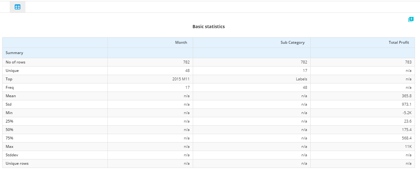
To provide, as much as possible statistical information of the selected report section, there are 3 report contents naming:
This report will show the basic statistic values such as Number of rows,
for each columns Of that report section data set. It is like statistical description.
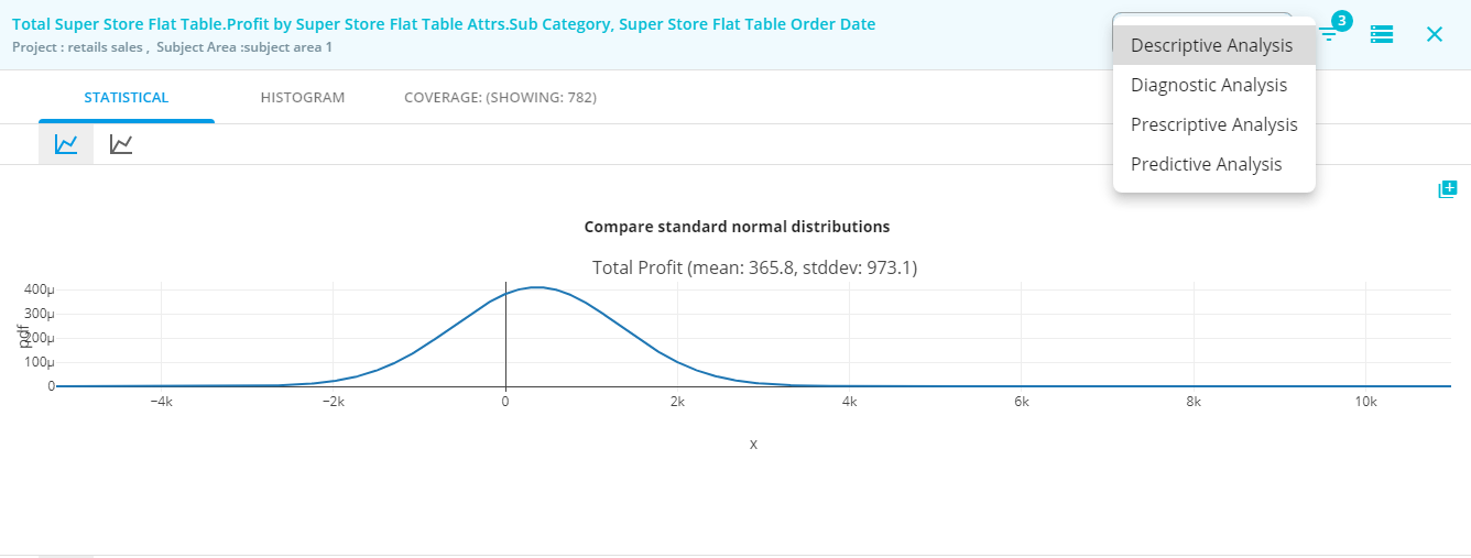
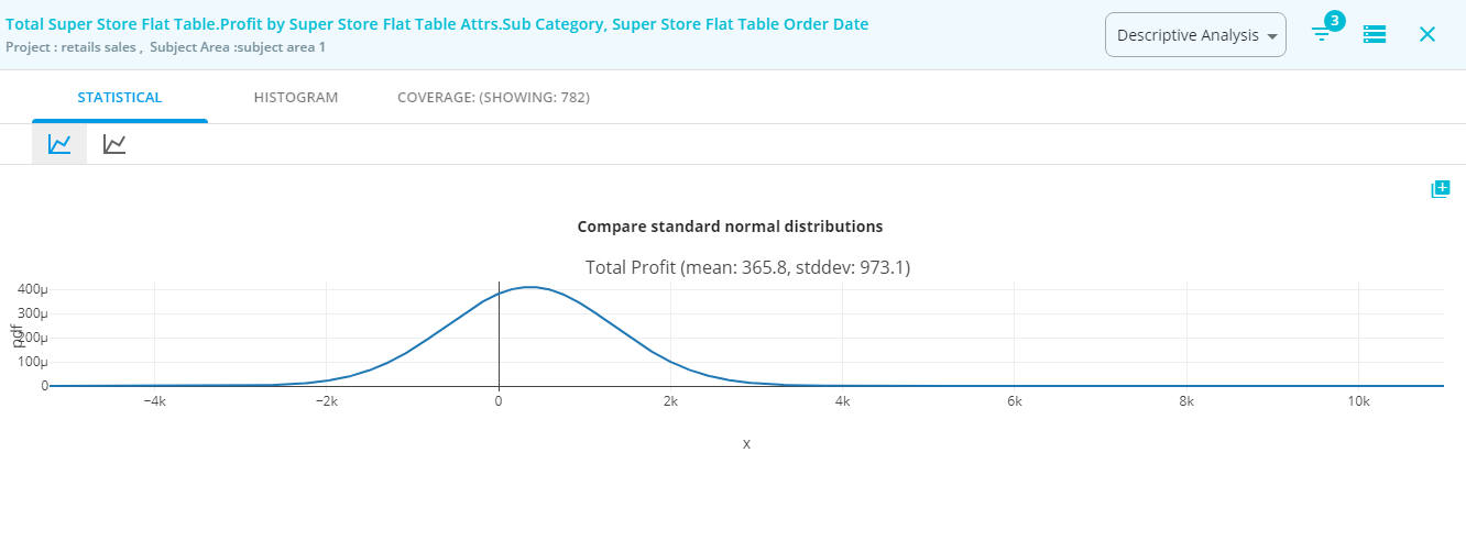
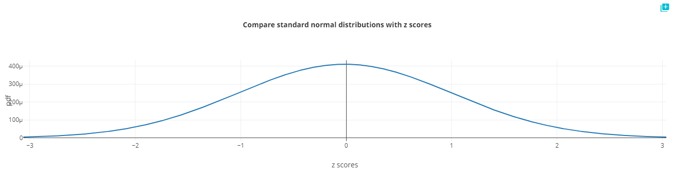
This report will show the standard normal distribution curve of the one or more measure/s in that report section with the Z- scores. Existence of more than one measure in the selected report section will lead to compare between the measures. Z-score placed in x-axis and probability density function that measure placed in y-axis.
A value from any normal distribution can be transformed into its corresponding value on a standard normal distribution using the following formula:
This report will show the standard normal distribution curve for the given measure. Measure range placed in x-axis and probability density function that measure placed in the y-axis. more than one measure in the selected report section will lead to comparing between the measures.
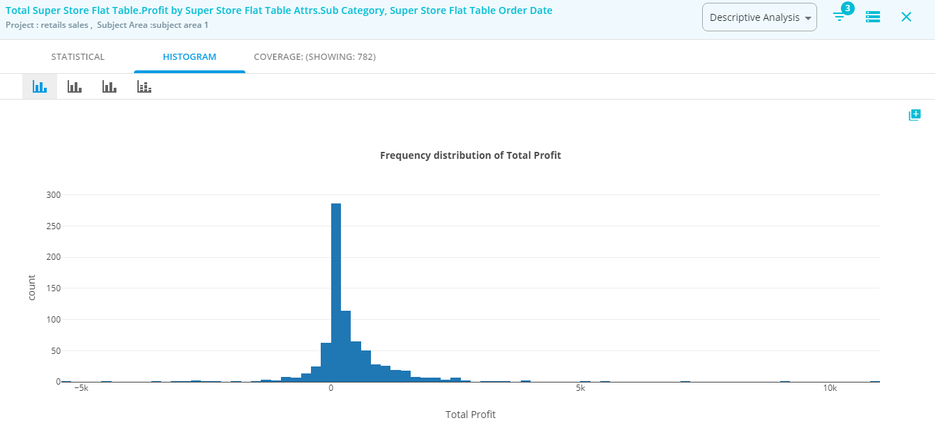
Histogram shows the underlying frequency of any continuous or series data to understand the whole data better. This will allow to inspect the data in which the distribution falls most. Discover the outliers, skewness, etc.
Histogram visualize the distribution of data over a continuous interval or certain time period or range of amount. Each bar in a histogram represents the frequency of each bin or interval. This analysis gives an estimation of where the values are concentrated, what the extremes are and whether there are any gaps or unusual values. They are also useful for giving a rough view of the probability distribution.
From the selected report section choose the analysis drop down and select Histogram will display the following analysis in BizStats.AI. In this case, only one measure is available for more than one measure case number of the histogram will be presented. Choosing the number of bins also possible.
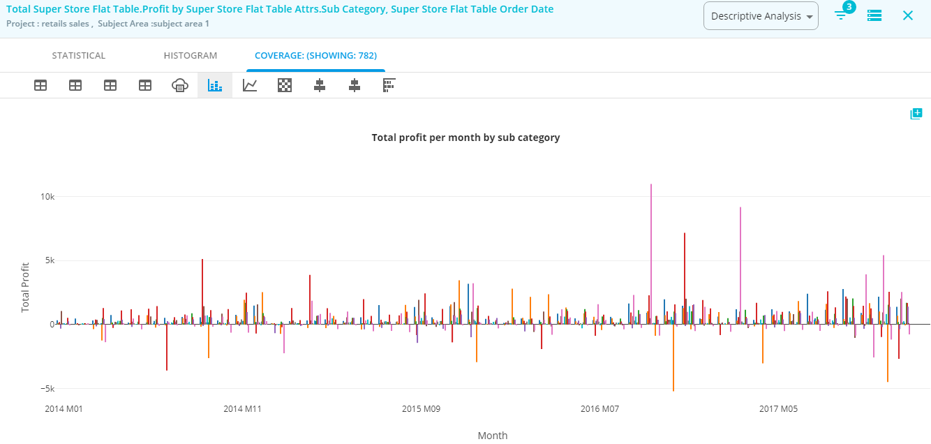
Coverage analysis is the actual analysis of the selected report section. This report section will give a clear picture of one or more measure(s) data with its respective one or more dimension(s) attribute data are places or grouped.
Bizstats will automatically transform the time dimension as the year, quarter, month, week and day analysis. For these, each criterion depends on the size of the selected data (number of rows and columns ) visualization perspectives are determined.
From the selected report section choose the analysis drop down and select Coverage will display the following analysis in BizStats.AI. This is going to be a detailed analysis of the selected data. Choose the perspective drop down under this analysis will give more possibilities of different pivot tables and different visualizations.
Learn more about visualization options here
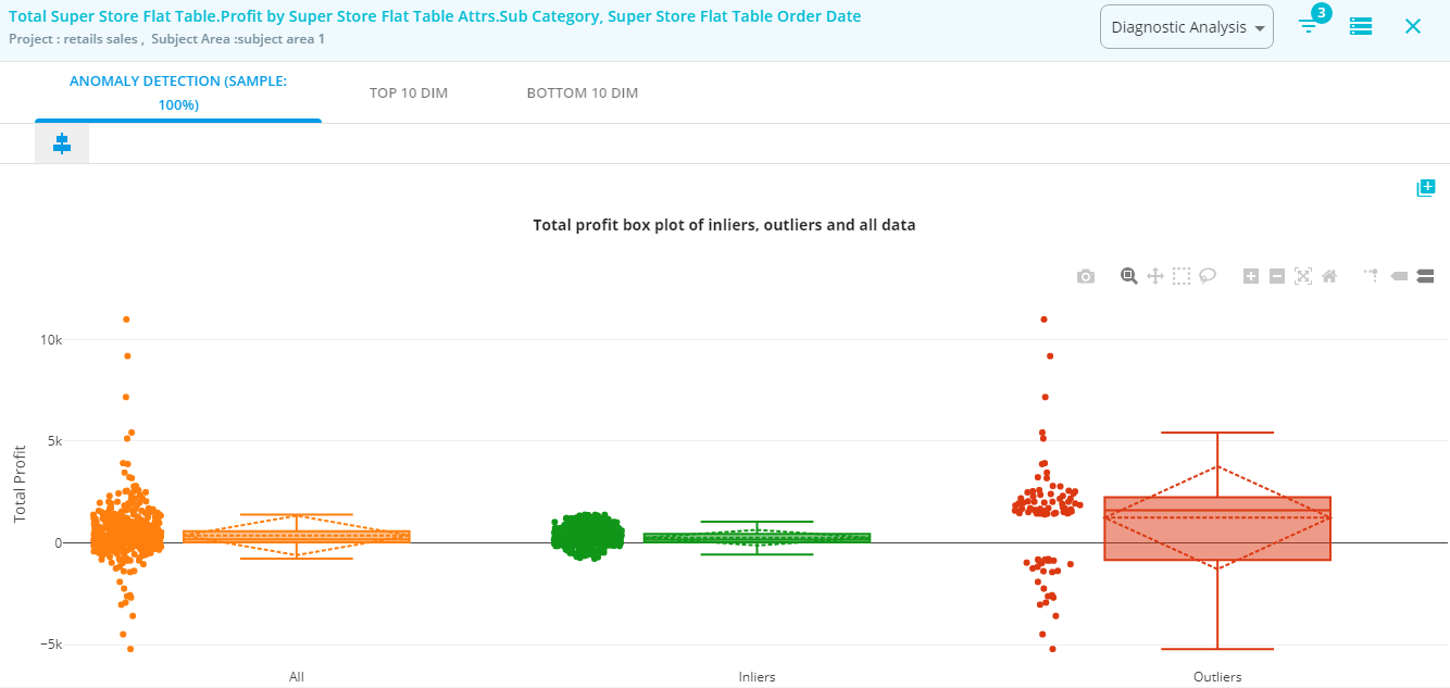
Anomaly detection to identify unusual patterns or outliers for the given data. Identification of rare or abnormal items, events or observations by differing significantly from the majority of the data, which raise suspicions or not to consider for further analysis.
Some businesses use cases are,
Currently, Interquartile Range (IQR) technique is listed in this analysis. We are working on to add more Machine Learning-Based Approaches like Density-Based Anomaly Detection, Clustering-Based Anomaly Detection, Support Vector Machine-Based Anomaly Detection.
The InterQuartile Range (IQR) will detect the presence of outliers. Outliers mean data values that fall outside of the overall pattern of most of the common data fall.IQR is using the rule to consider any data point is actually an outlier.
Form the given dataset can be described into following details
The InterQuartile Range (IQR), From the above details, we can derive
IQR = Q3 – Q1
The interquartile range shows how the data is spread about the median. It is less susceptible than the range to outliers.
Rule for Outliers
values below this lower range and above the upper range are considered as outliers of the given data set. In this analysis All represents the whole data placement (color:orange) from that using IQR technique finds inliers in green color, and the outliers are identified in red color.
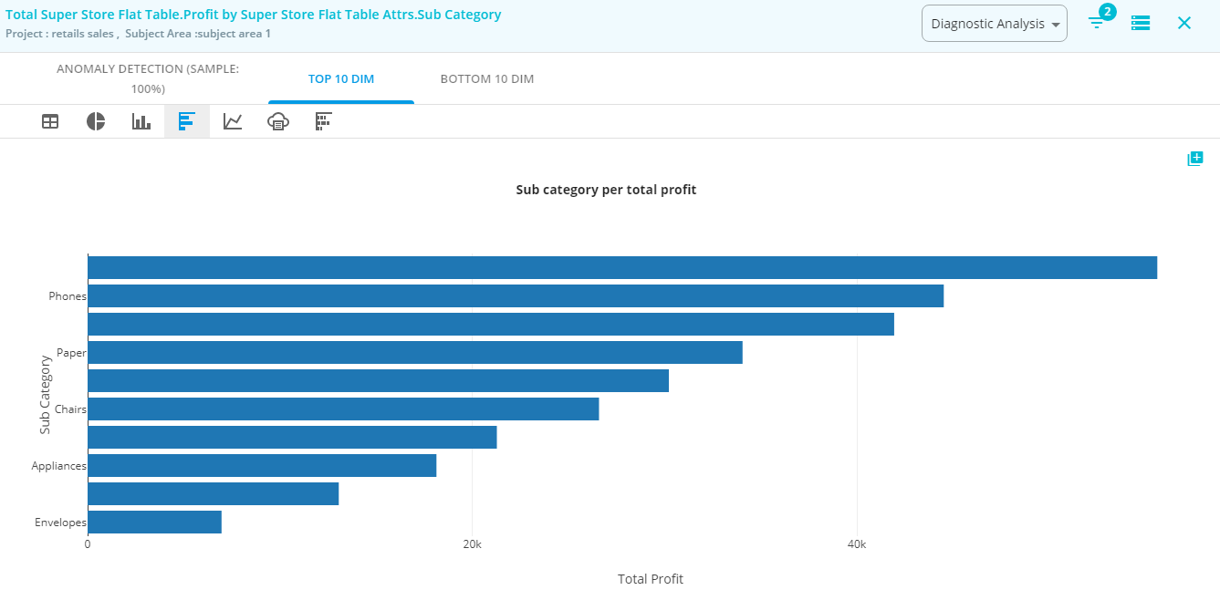
This analysis will show the top 10 data row in term of measure data values with the selected combination of dimension attributes. In this example, top value for a monthly product category is listed. Combining all the attributes sorting the measure column high to low then pick the top ten rows. If more than one measure exists to do the same for each measure.
This will give a clear insight of
Choose the perspective drop down under this analysis will give more possibilities of different pivot tables and different visualizations. Learn more about visualization options here